

TL;DR
This release broadly focuses on:
- Agent Observability: inspect agent invocations, token usage, model usage, latency, errors, tool calls, sentiment and span-level details from a dedicated Agents page.
- UI revamp: move through logs, metrics, traces and datasets with a cleaner interface, clearer page context and top-level dataset selection. Also features like view metric counts and metadata, infer y-axis units automatically, run instant queries, and choose plot types like
avg(rate),sum(rate),max(rate)andmin(rate)have been added.
Agent Observability
We are in the early days of using agents in everyday software, yet they are already becoming part of how many systems work. Sometimes we interact with them directly, and sometimes they run quietly behind a workflow. And debugging these agents is difficult because a single request can involve several steps: an LLM call, a tool call, an external API, a retry, and finally a response back to the user. So when something goes wrong, it is not enough to know that the agent failed. You need to understand what happened during the full invocation.
So, we are excited to announce that with Parseable v2.9.0, we have added Agent Observability.
This is entirely built on top of GenAI OpenTelemetry semantic conventions, so the telemetry follows a standard shape for model calls, token usage, inputs, outputs, tool calls, and agent spans. The idea is that agent telemetry should not live in a custom black box. It should be observable like the rest of your system.
When you open the Agents page, you first land on the Overview tab.
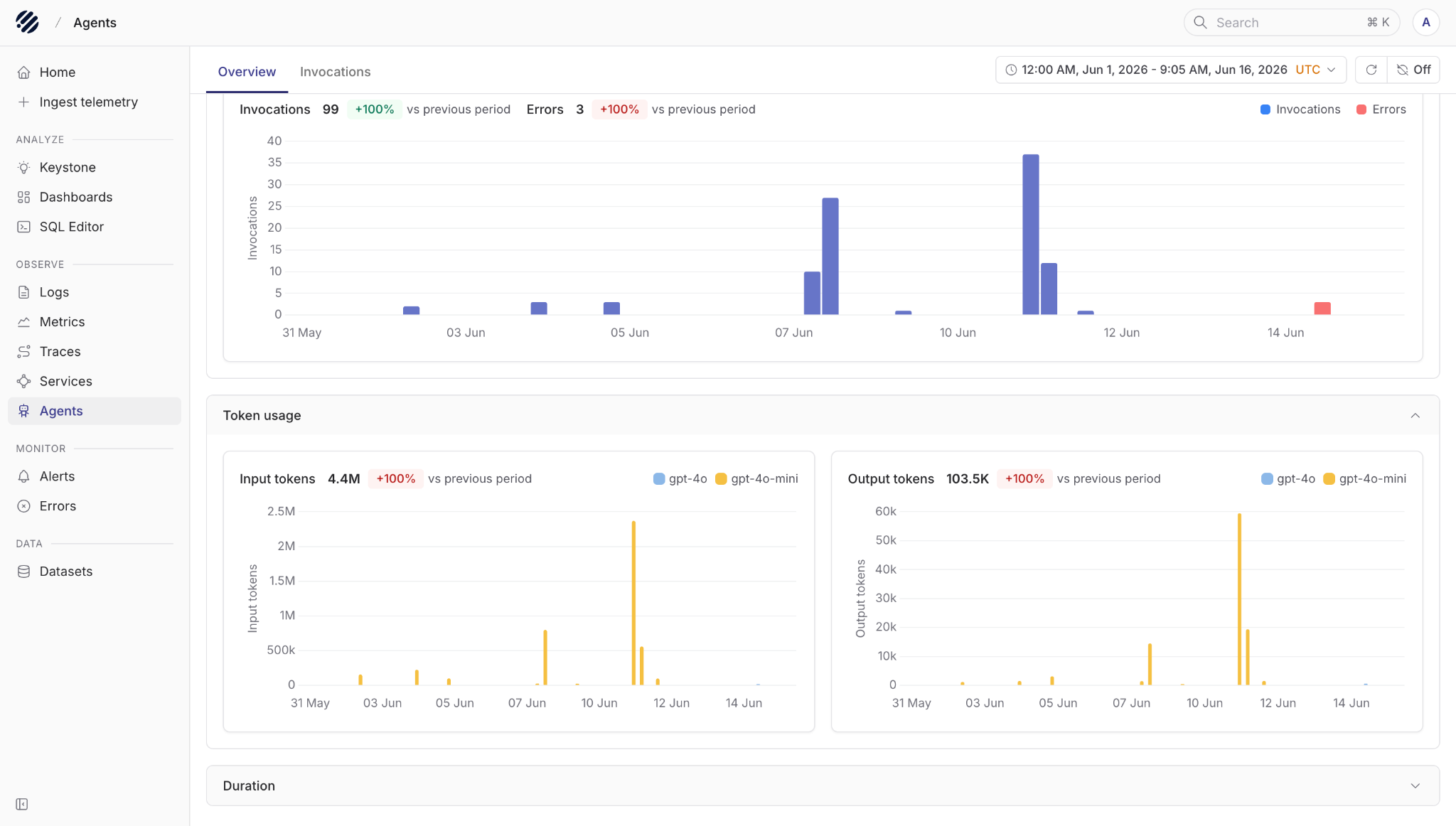
The overview gives you a quick sense of how your agents are behaving over a selected time period. You can see total invocations, errors, token usage, and duration trends. Token usage is split into input and output tokens, and you can also see which models are being used, for example gpt-4o, gpt-4o-mini or others.
This helps answer the first set of questions we usually have:
- How many agent invocations happened?
- Are errors increasing?
- Which model is using the most tokens?
- Are token spikes coming from prompts or responses?
- Are agent runs getting slower?
From there, you can switch to the Invocations tab.
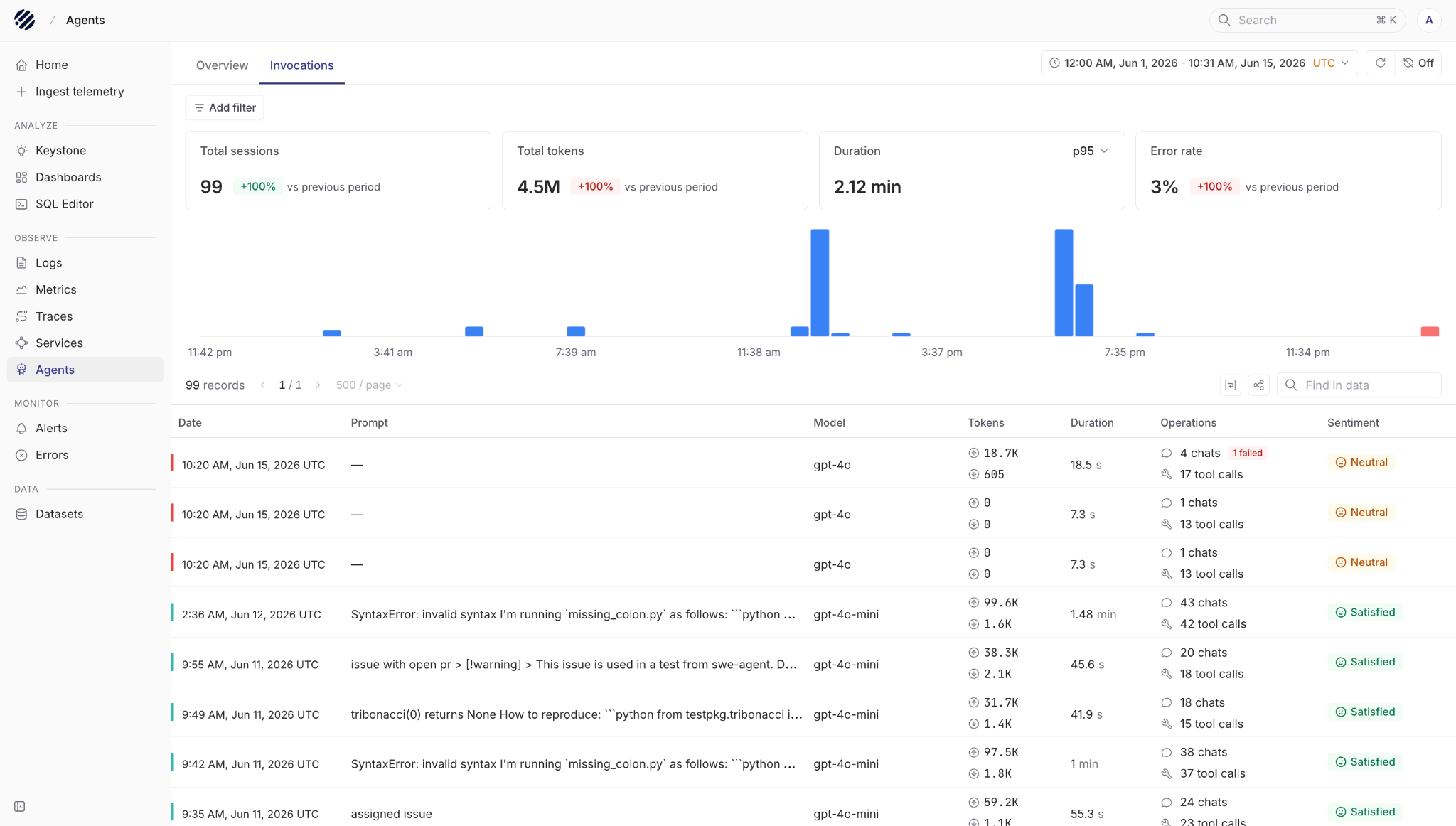
This view is where you start looking at actual sessions. At the top, we see things like total sessions, total tokens, latency, and error rate for the selected period. You can filter the data and also search within the table when you are looking for a specific prompt, model, or run.
Each row gives you the important details of an invocation: when it happened, the prompt, the model used, token usage, duration, number of chats, number of tool calls, and the final sentiment.
The sentiment column is useful because not every bad agent run fails with an error. Sometimes the tool calls work, the model responds, and the request still produces an answer that is not good enough. Sentiment gives you another signal to find sessions that may need review, especially when debugging poor answers, user dissatisfaction, or possible hallucinations.
If you want to understand a specific session, you can click into it and drill down further.
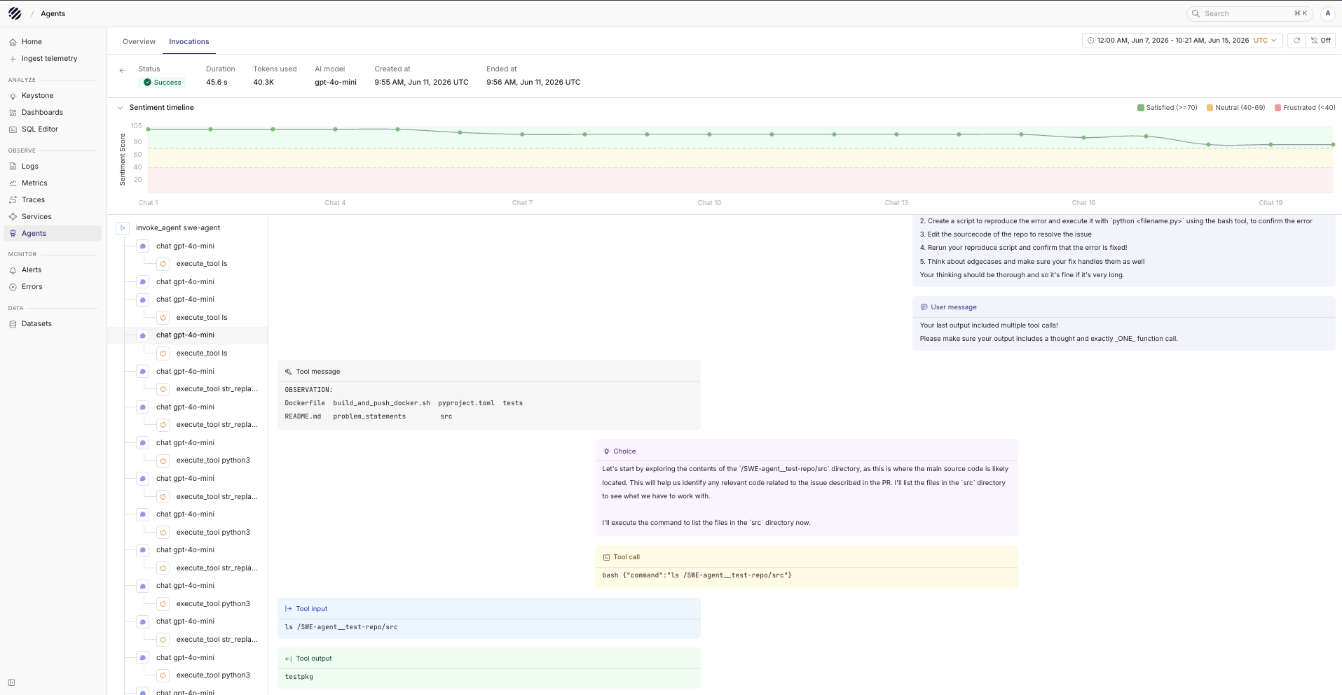
In the detailed view, you can see the complete flow of the agent invocation. For example, in this case the agent is using swe-agent. You can inspect the prompt given to the agent, the chat steps that followed, the llm calls made internally, and the tools that were called during the run.
For every tool call, you can see the input sent to the tool and the output received from it. This makes it much easier to understand how the agent moved from one step to the next, instead of trying to reconstruct the run from scattered logs.
You can also click into individual interactions to inspect span-level details. This is useful when you need to debug a specific LLM call, tool execution, latency issue, or failure inside a longer agent workflow.
Agent Observability is our first step towards making Parseable useful for teams building AI-native applications in production. The goal is not only to show that an agent ran. The goal is to show how it ran, where it spent time, what it used, what it called, and where the answer started to drift.
UI Revamp
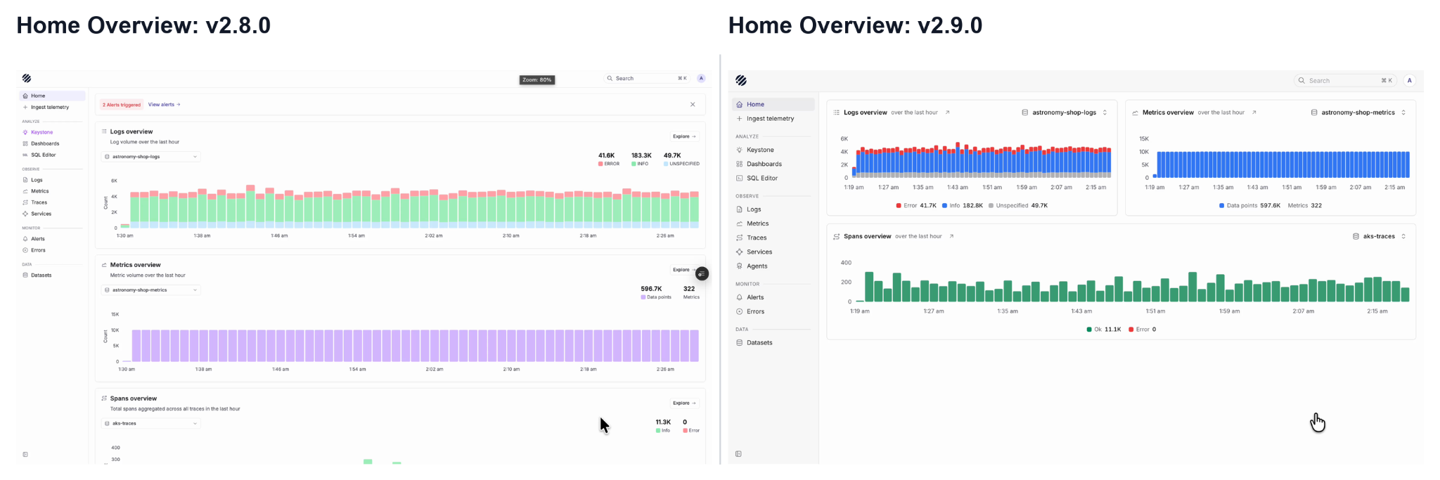
With the v2.9.0 release, we have refreshed the Prism UI to make the observability workflow more consistent and easier to navigate across logs, metrics and traces.
One of the first changes users will notice is the new page context at the top. When you are inside Logs, Metrics or Traces, the selected dataset now appears in the top bar along with the current section. This makes it easier to understand where you are, which dataset you are looking at, and what view is currently open.
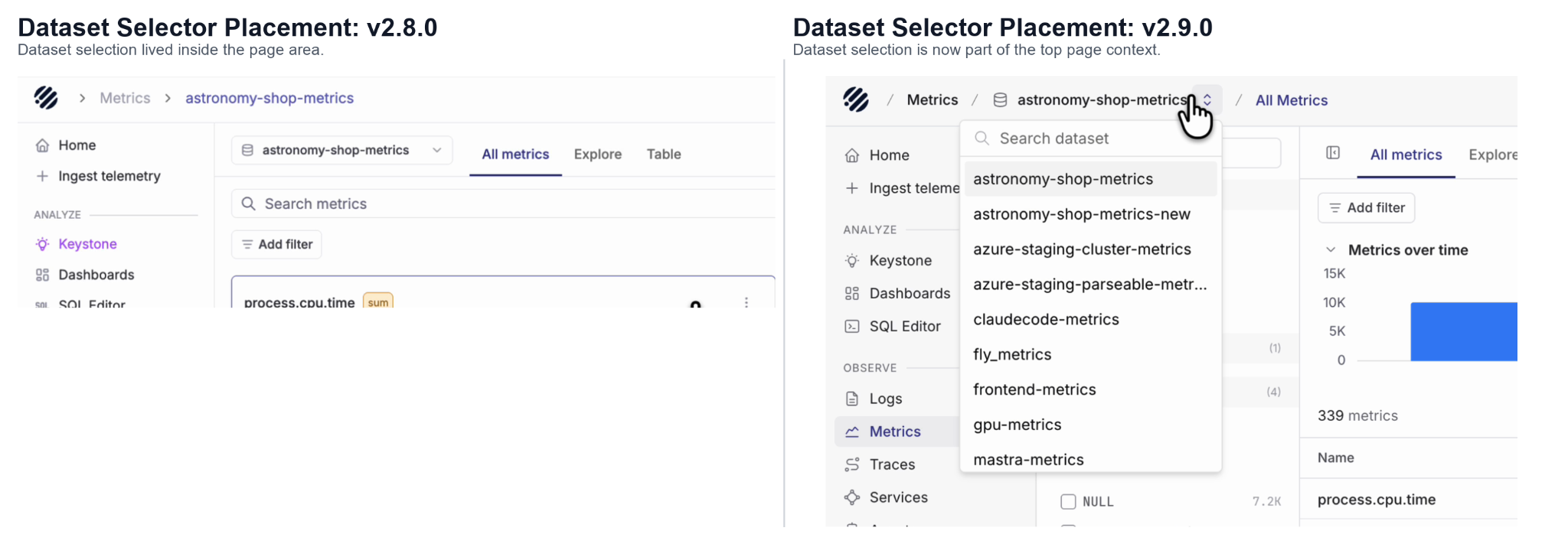
Earlier, dataset selection was placed more inside the page content. In v2.9.0, it has been moved closer to the main navigation context, so switching datasets feels more natural while moving between logs, metrics and traces.
The Home page has also been cleaned up. Logs, metrics and spans are now shown in a more compact overview, giving users a quick view of system activity without needing to scroll through large stacked sections.
Metrics
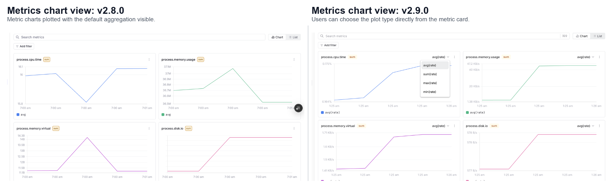
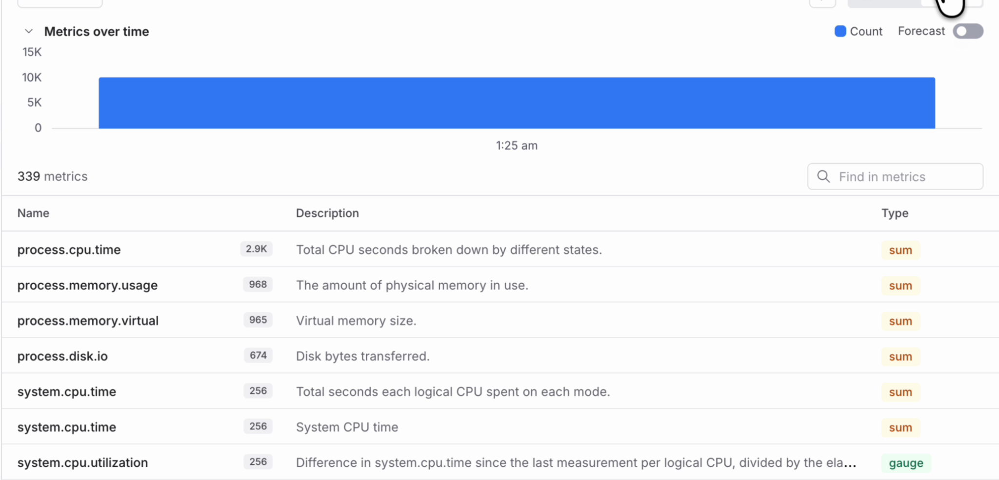
Metrics experience has changed more visibly. The all metrics view now gives users a clearer list of available metrics, including metric name, description and an option to plot based on the type such as sum or gauge. Users can search metrics, switch between chart and list views, and quickly understand what metrics are available in the selected dataset.
Additionally, in v2.9.0 we have added the metrics listing page that now shows the total number of metrics available in the selected dataset. Each metric row also shows useful metadata such as description, count and metric type. This makes it easier to understand the shape of your metrics data before jumping into a chart or query.
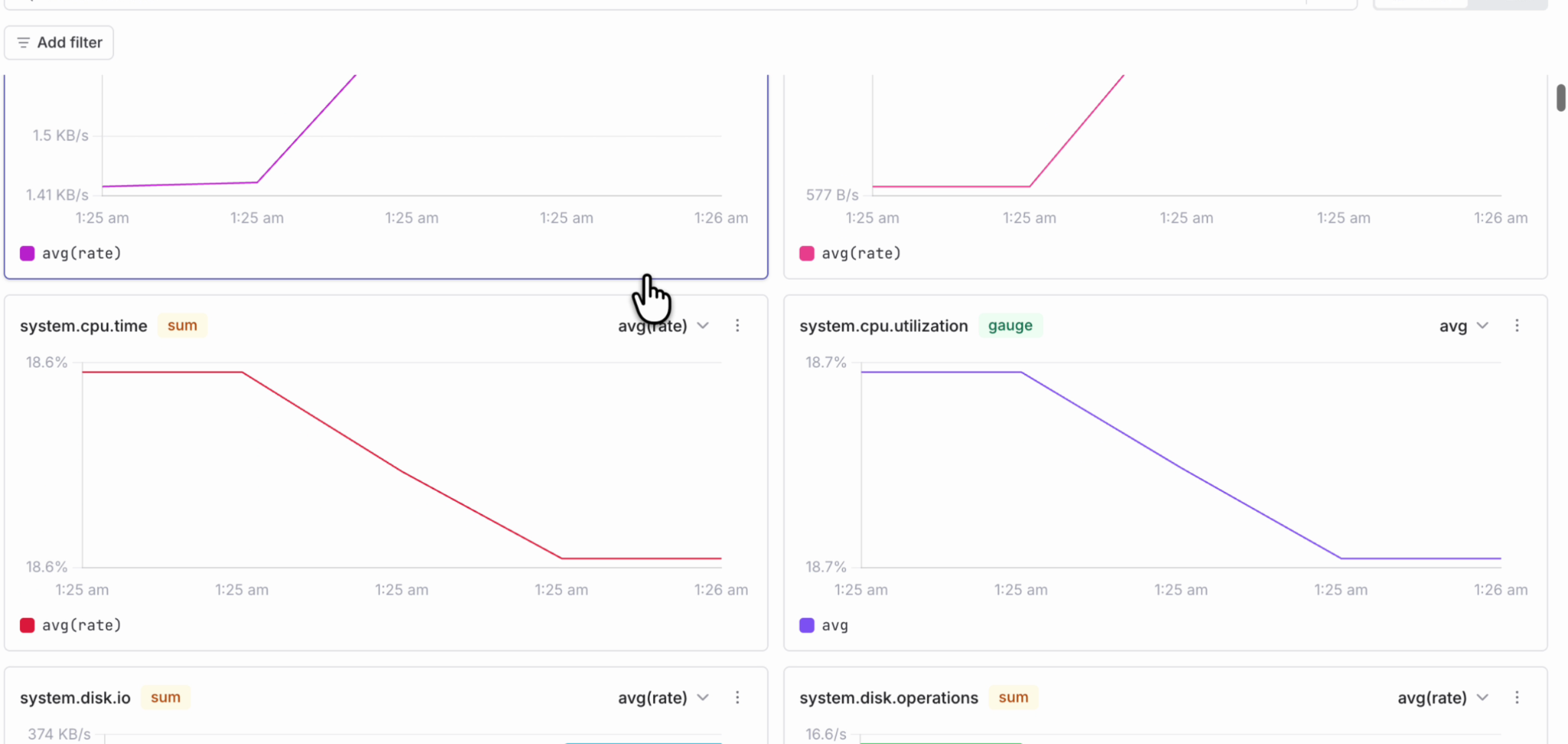
Also the metric charts now infer y-axis units from the metric name and type. This works for both OpenTelemetry dot notation and Prometheus underscore notation. For example, charts can now show units like KB/s, % or /s directly on the axis, making metric graphs easier to read without manual configuration.
Furthermore, the metrics explore now support instant queries option, where you can choose between range, instant or both query types while building a metric query. This is useful when you want to quickly check the current value of a metric without running a full range query every time.
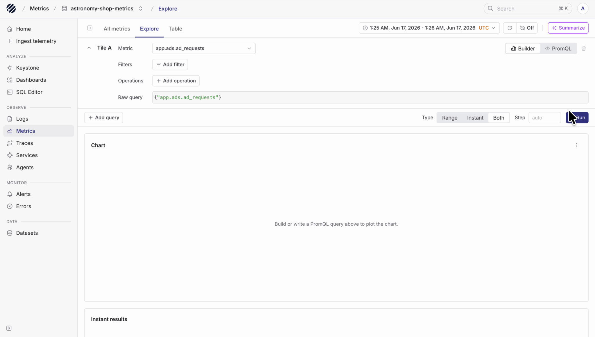
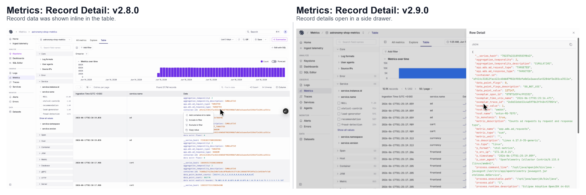
Metric charts are also easier to read, with clearer chart controls, aggregation options and units. The table view now follows the same detail pattern as logs, where users can open a row and inspect the full JSON in a side panel.
Traces
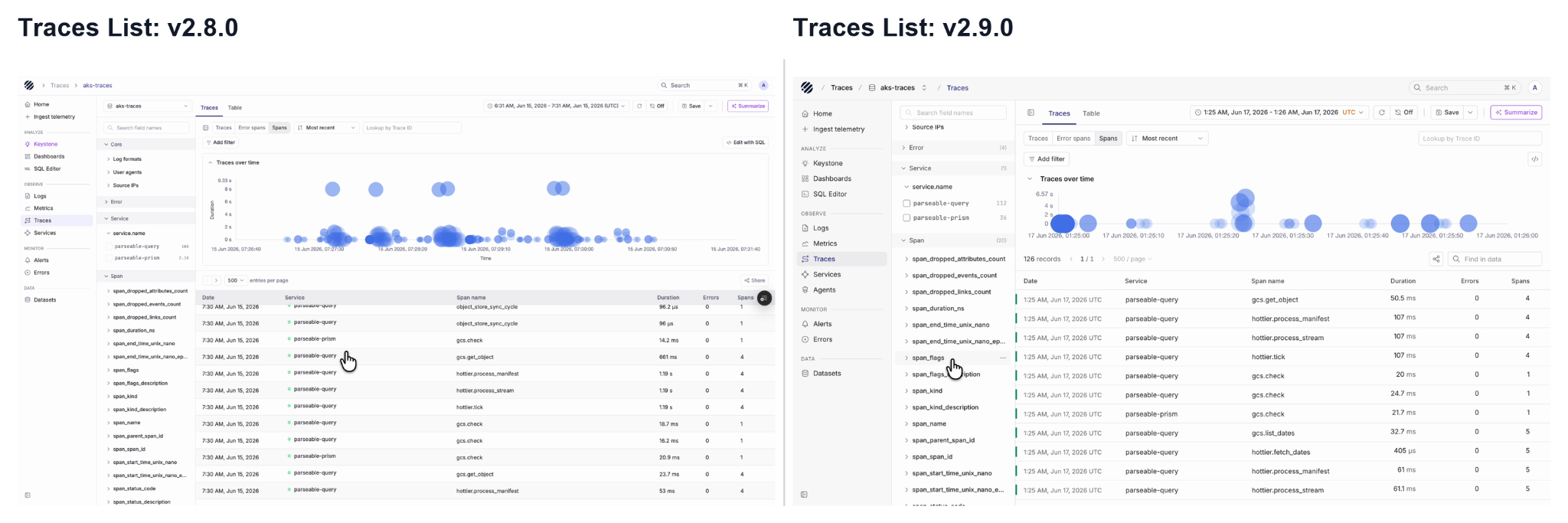
The Traces page keeps the familiar investigation workflow, but the layout is cleaner, as users can view traces over time, filter by service and span fields, search by trace ID, and switch between traces, error spans and others. Opening a trace shows the waterfall view with duration, span count and nested spans, making it easier to understand where time is spent inside a request.
Logs
The Logs page now follows the same structure as the rest of Prism.
Users can see log volume over time at the top, filter logs from the left panel, group logs by fields such as log category, and inspect the matching records in the table below.
When a user wants to look at a specific log event, they can open the row detail panel and inspect the full JSON payload without leaving the current page. This makes it easier to move from a log trend to an individual event.
Datasets
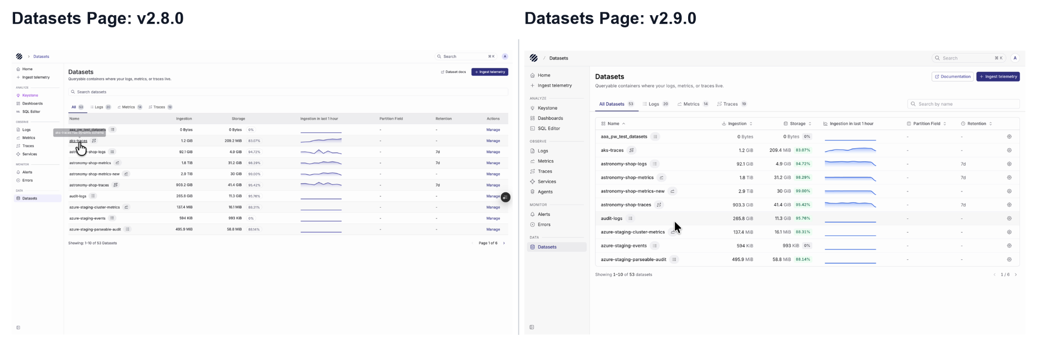
The Datasets page has also been refreshed, as users can switch between all datasets, logs, metrics and traces, search datasets by name, and see ingestion, storage, partition field and retention in a cleaner view. The action column is also simplified, making the page feel more like a starting point for exploration.
Overall, the Prism revamp is not just a visual cleanup. It makes the product easier to navigate by putting the current dataset, current signal and common actions in predictable places across the UI.
For a detailed list of new features, updates and fixes, please refer to the full release note on GitHub.

