When I joined Parseable eight months ago, I didn't know much about observability. The word kept coming up in every engineering standup and design review, and I kept nodding along, trying to piece together what it actually meant. Logs, metrics, and traces felt like someone else's problem.
Eight months later, I think about observability every single day. Not because I became an engineer. Because I finally understood what was actually at stake, and how much of product work depends on being able to see what your systems are doing in production.
This article is for product people: product managers, product designers, and anyone who ships software and wants to understand what is actually happening after they ship it.
What is actually at stake
Before getting into what logs, metrics, and traces mean, it is worth understanding why any of this matters.
Companies spend enormous amounts of money on their products. Engineering teams of dozens or hundreds of people. Infrastructure costs running into millions. Years of accumulated code, systems, and user trust.
And all of it can unravel in minutes.
A payment system goes down during peak hours. An API starts timing out silently. A database runs out of connections and requests start queuing. Users hit errors, get frustrated, and leave. Not to come back.
The stakes are not abstract. For an e-commerce company, an hour of downtime can mean hundreds of thousands of dollars in lost revenue. For a SaaS business, a week of degraded performance can trigger churn that takes months to recover from. For a startup, a bad incident at the wrong moment can be existential.
Observability is what stands between "we know something is wrong and we know exactly what" versus "something is wrong and we have no idea where to start." The teams that invest in it respond to incidents in minutes. The ones that do not spend hours, sometimes days, in the dark.
What observability actually is
Think about the last time something broke in your product. Maybe a user reported it. Maybe someone on the team noticed. Maybe you found out through a support ticket three days later. Now think about how long it took to figure out what actually went wrong.
That gap, between something breaking and someone understanding why, is what observability is designed to close.
Observability is the ability to understand what is actually happening inside your systems — not what you assumed, not what users report — but what the data shows, in real time.
When you ship a feature, you make a series of assumptions: users will flow through it this way, it will load in a reasonable time, errors will be rare and recoverable. Observability is what tells you whether those assumptions held up in production or quietly fell apart.
This data comes in three forms, each answering a different question. The primary users of this data day to day are developers, SREs, and DevOps engineers. But the insights that come from it should inform every product decision a PM or designer makes.
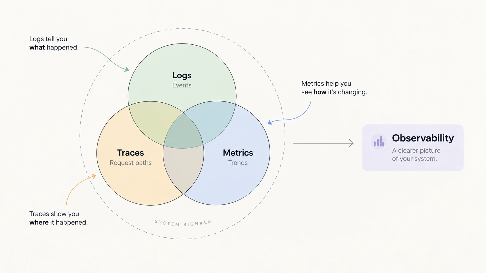
Logs, metrics, traces: the three signals behind observability
Logs: the detailed event record
Logs are timestamped records of everything that happens in your system. Every user action, every error, every state change, written down in sequence with precision.
[2024-02-12 14:32:18] user_id=alice event=login status=success
[2024-02-12 14:32:45] user_id=alice event=add_to_cart product_id=4521
[2024-02-12 14:33:02] user_id=alice event=checkout amount=49.99 payment_method=stripe
[2024-02-12 14:33:05] user_id=alice event=order_confirmed order_id=88291
Each line tells you what happened, when it happened, and to whom.
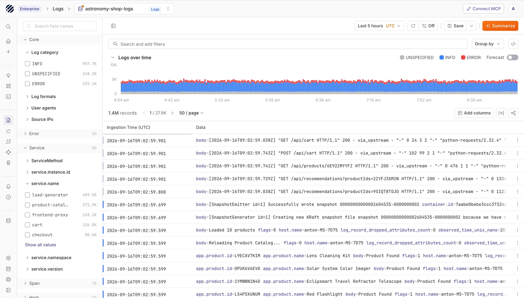
A real log view makes the system readable: categories, volume over time, and individual events in one place.
Why product people care:
Logs reveal the actual user journey, not the intended one. You designed a flow, tested it, and felt confident it worked. Then you look at logs and discover real users taking completely different paths. They go back and forth. They hit errors you never anticipated. They abandon at steps you thought were straightforward.
Consider checkout abandonment. Your analytics shows 68% conversion and you move on. But logs tell you why the other 32% did not convert:
- 12% hit payment errors
- 8% abandoned during shipping calculation
- 7% got stuck on promo code validation
- 5% experienced timeout errors
Each of these is a different problem that needs a different solution. Summary numbers hide this. Logs surface it. If users are repeatedly bouncing between two screens, logs will show that pattern before any user ever tells you something is confusing.
Metrics: measuring what changes over time
Metrics are numbers measured continuously over time. Response time, error rate, active users, conversion rate. They tell you how your product is performing right now and how that is trending.
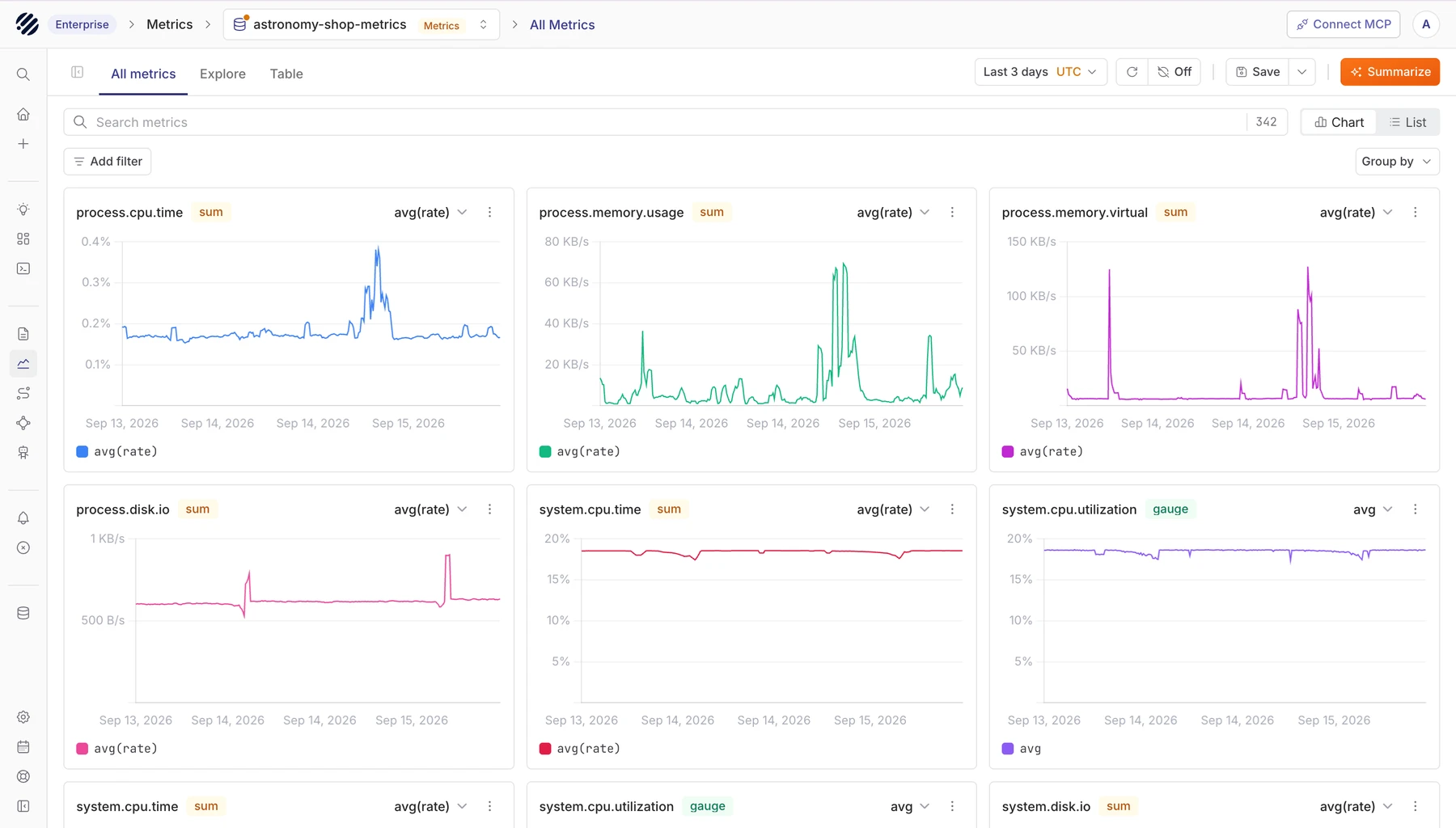
Metrics make change visible: spikes, drops, and trends that are hard to see in raw events.
Why product people care:
Metrics separate opinion from reality. Here is a scenario that plays out constantly: a team redesigns their homepage. Design looks great. User testing is positive. Everyone is excited. They ship it. Then they check metrics:
Before: 1.2s load time, 12% bounce rate, 71% engagement
After: 4.8s load time, 28% bounce rate, 52% engagement
The redesign made the product objectively worse. User testing captured aesthetic preference. Metrics captured what actually happened to users. Without metrics, the team would have celebrated while users quietly left.
Percentiles matter more than averages:
Averages smooth over the worst experiences. If 95% of your users complete checkout in 2 seconds but 5% take 45 seconds, your average might look acceptable. But that 5% could be your mobile users, your highest-paying customers, or everyone in a specific region.
Percentiles show you the full distribution. They are usually written as P50 (the midpoint — what most users experience), P95 (the slowest 5%), and P99 (the slowest 1%). Netflix does not optimize for average buffering time. They track P99 latency because with 200 million subscribers, 1% having a bad experience means 2 million people.
Should you optimize search or checkout? Instinct says search because it feels slow. Metrics show search handles 50K daily queries, and even the slowest 5% complete in about a third of a second. Checkout handles only 5K daily attempts, but the slowest 5% take over 8 seconds. Checkout ruins fewer users but ruins them completely. Metrics make that decision obvious instead of political.
Traces: understanding request flows
Traces show the complete journey of a single request through your system. When a user clicks checkout, that one action might touch your frontend, API gateway, inventory service, database, Stripe, and SendGrid before they see a confirmation. A trace captures every step and shows exactly how long each took.
Checkout Request: 4,850ms total

├─ Frontend (20ms)
├─ API Gateway (15ms)
├─ Validate cart (45ms)
├─ Check inventory (120ms)
│  └─ Database query (95ms)
├─ Apply promo code (4,200ms) ← bottleneck
│  └─ Promo database query (4,150ms)
├─ Process payment via Stripe (312ms)
└─ Send confirmation email (180ms)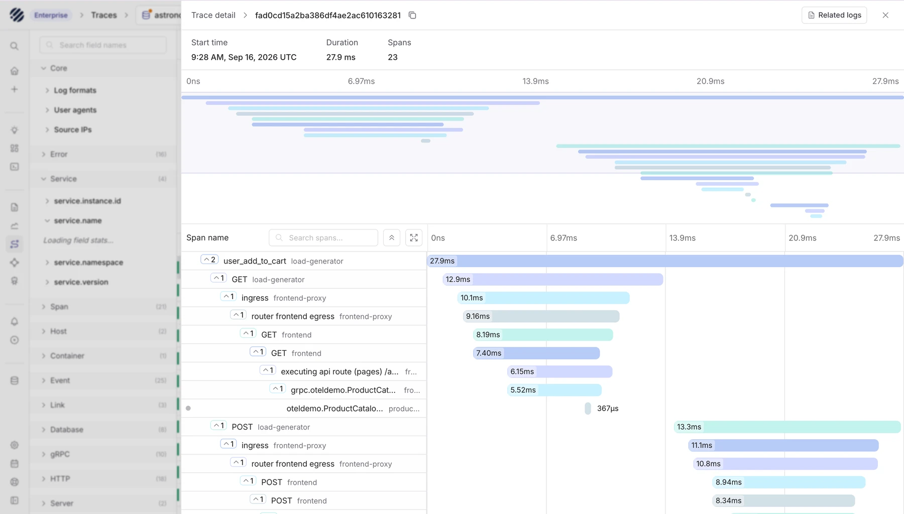
A trace waterfall turns one user action into a timeline, showing which services ran and where time was spent.
Why product people care:
Without traces, debugging a slow feature turns into a blame game. Frontend says their code is fast. Backend says their API is fine. Database team says queries are optimized. Everyone defends their component and nothing gets fixed.
With traces, you look at the data. The promo code step takes 4.2 seconds because it is searching through 10 million records one by one, the slowest way possible. Everything else is fine. Now you have a real product decision: optimize that query, simplify the promo logic, or move promo application to an earlier step in the flow.
Traces also change how you design. You built a checkout flow with smooth animations. Users still say it feels slow. Traces show you:
├─ Process payment (890ms)        ← user waits here
├─ Generate invoice PDF (1,200ms) ← user waits here
├─ Send confirmation email (380ms) ← user waits here
└─ Show success screen (20ms)
Your animation is not the problem. The backend sequence is. Show the success screen immediately after payment and handle the invoice and email in the background. The user feels like things are instant. Traces gave you the information to design that properly.
How the three work together
2:47 PM on a Tuesday. Your app suddenly becomes slow.
Metrics alert you first. P95 response time jumped from 200ms to 5 seconds. Something changed. You know when, but not what.
Traces show you where. Every slow request shows the same pattern:
Request (5,200ms total)
├─ Frontend: 20ms ✓
├─ API: 35ms ✓
├─ Recommendation service: 4,800ms ❌
├─ Database: 320ms ✓
└─ Payment: 312ms ✓
Logs explain why.
[14:47:45] WARN: Database connection pool at 95% capacity
[14:47:58] ERROR: No available database connections (pool exhausted)
[14:48:02] ERROR: Connection pool maxed at 100/100 connections
The connection pool filled up. Think of it like a limited number of checkout lanes at a supermarket: when all lanes are busy, every new customer has to wait. When the pool hits its limit, every new request queues behind it. The fix: increase the limit from 100 to 300. Problem resolved in five minutes. Without all three, that same incident is still ongoing.
What designing for observability taught me
Here is what eight months of building an observability product actually taught me about product design.
1. Too much data on a limited screen is a design problem in itself
Observability interfaces deal with enormous density. Logs streaming in, tables with hundreds of rows, metrics updating every few seconds. The temptation is always to show everything. The right call is almost always to show less, more clearly. The most valuable work I have done at Parseable has not been adding features. It has been helping users find what they need at the exact moment they need it, without overwhelming them the rest of the time.
2. Small visual signals carry enormous weight
We added color to log lines at Parseable. Red for errors, blue for normal. Before you read a single word, you know whether something needs your attention. In a table with thousands of rows, that kind of immediate signal changes how fast someone can orient themselves.
3. Context matters as much as the data. So does what you show when there is none.
We built a log context view. When you click on a specific log line, you see everything that happened five seconds before and after it. When you are debugging an incident, that surrounding context often tells you more than the log line itself. The same logic applies to empty states and error states. What a user sees when there are no logs, when a query returns nothing, when the system cannot connect, is as important as the happy path. A blank screen with no guidance when someone is already stressed is its own kind of failure.
We took this further with one specific empty state: when a user's selected time range has no logs, instead of showing nothing, we show a button that jumps them to the most recent time range that does have data. One click instead of manually hunting through time ranges while already under pressure.
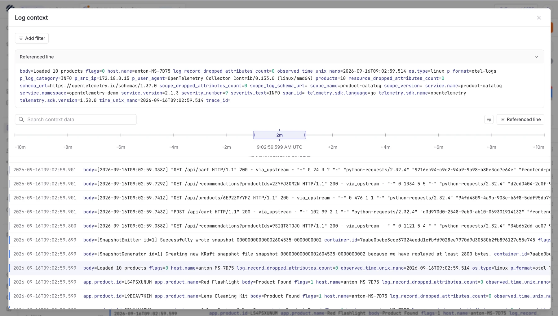
The referenced line is useful, but the surrounding events are often what make the problem understandable.
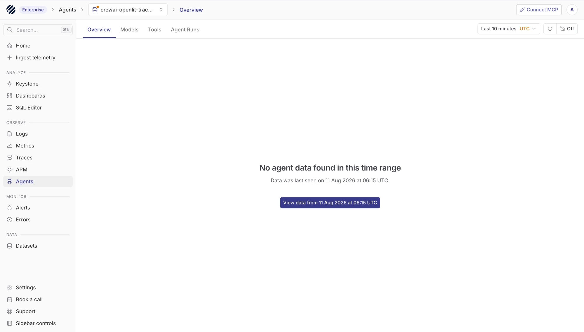
When the selected time range has no data, a single button jumps you to the last known time range instead of leaving you with a blank screen.
4. Small UX decisions compound into big time savings during incidents
We added an expand all sections toggle on the dashboard. We built a dedicated error page so users can jump straight to errors without hunting. These sound tiny. But the primary user of an observability tool is someone whose production system is already down, whose phone is already ringing. Not having to click through four levels of navigation at that moment is the difference between a five-minute resolution and a twenty-minute one.
The most impactful design decisions we have made at Parseable have not been new features. They have been removing friction from the moments that matter most. I now measure a UI change not by whether it looks better in review, but by whether it makes an on-call engineer faster at the worst point in their night.
5. Observability changes what iteration means
Before working on Parseable, shipping a feature meant waiting: for support tickets, for NPS surveys, for someone to eventually tell you something was wrong. Feedback loops were measured in weeks. Now when we ship something, I can watch what happens almost immediately. Are users hitting the new flow? Where are they dropping off? Are error rates changing? The data is there within minutes of a deploy.
That compresses the whole product cycle. You stop treating launch as a conclusion and start treating it as the beginning of a data conversation. "Let's revisit this next quarter" becomes "let's look at what happened today and decide tomorrow."
6. Always design for the user who is breaking
The primary user of an observability tool is not someone leisurely exploring data. They are someone whose production system is down, whose phone is ringing, and who needs answers in the next two minutes. Every design decision should be evaluated through that lens. Can they find what they need fast? Is the most critical information the most visible? A feature that exists but cannot be found when someone is already panicking is not really a feature. Design for the worst moment, and the calm moments take care of themselves.
7. Accessibility is not optional in data-heavy interfaces
Graphs, charts, and tables are everywhere in observability. And they are notoriously bad for accessibility. Color alone cannot convey meaning. Tooltips need to be keyboard navigable. Hover states need to work under pressure, not just in demos. A colorblind engineer on-call at 2 AM should be able to read your error graphs just as fast as anyone else. This is not a nice-to-have. It is a requirement that most observability tools quietly fail.
8. Format is how meaning lands
Most observability tools that show agent activity display it as a flat, bland list of events. Agent called tool X. Agent returned result Y. Agent called tool Z. It is technically complete but cognitively exhausting to parse. What we did was redesign this into a proper conversational format, showing agents talking to each other, tool calls displayed inline in context, responses threaded naturally. Think of how a readable conversation feels versus a raw transcript. The information is the same. The comprehension is completely different. When you are trying to understand what a complex multi-agent system did and why, format is not decoration. It is the thing that makes the data usable.
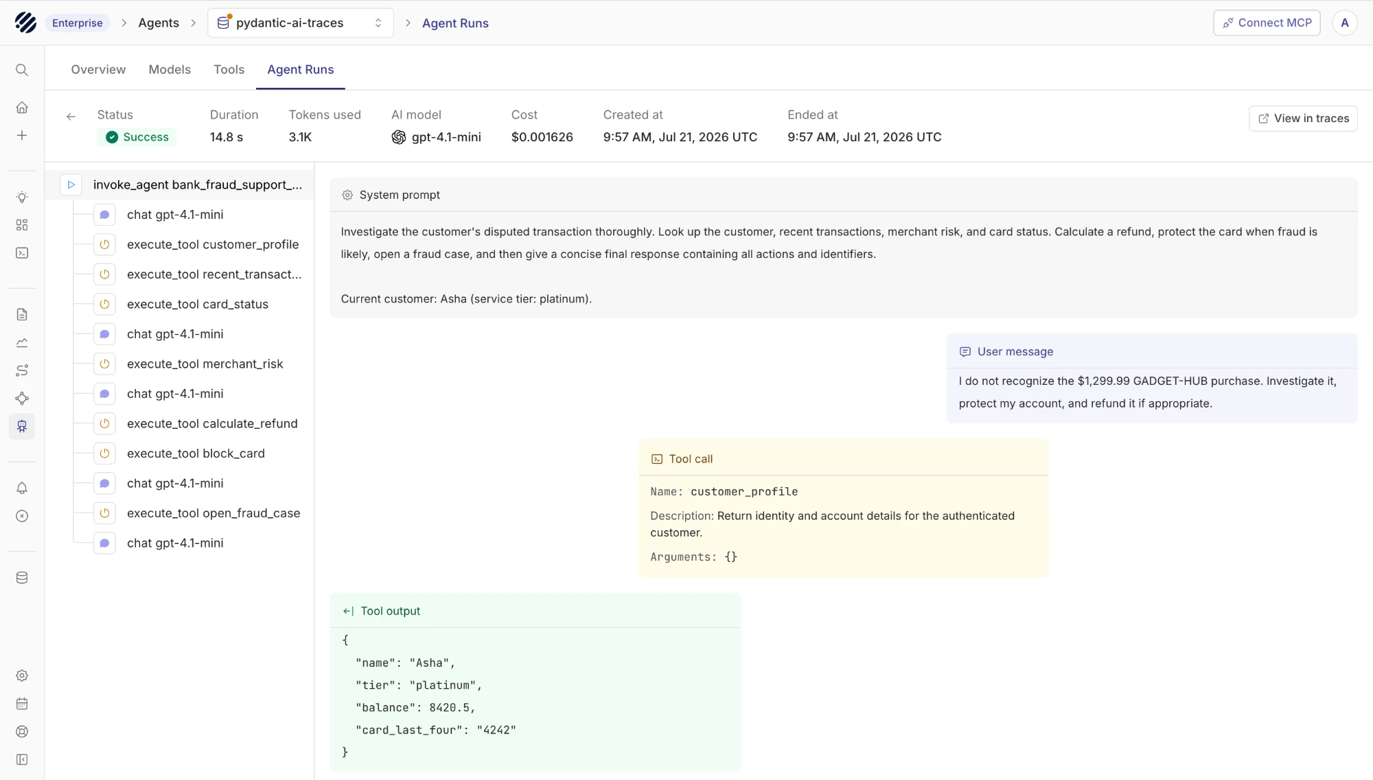
Agent activity displayed as a conversation: tool calls, outputs, and model responses threaded in context rather than listed flat.
Where Parseable fits
Something I did not expect when I joined was how many teams we would talk to who had simply given up on having proper observability. Not because they did not care. Because the cost had made it impossible to justify. Teams watching their log bills hit $20,000 or $30,000 a month and quietly making cuts: shorter retention, fewer services instrumented, slower ingestion to stay under budget. Every cut makes your blind spots bigger. You end up spending a lot of money to see less of your own system.
That is the specific problem Parseable is built to solve. Storage on object storage like S3 means you can keep everything without watching a bill spiral. But cost is only half of it.
The other half is that most observability tools are genuinely painful to use. Dense UIs, steep learning curves, features buried three menus deep. Parseable is designed differently. Every part of the product is built around the moment when something is wrong and you need answers fast, not around impressing someone in a demo.
If cost or complexity has been the reason you have been putting observability off, give Parseable a try. It is free to get started.
The gap between intention and reality
The gap between what you designed and what users actually experience exists in every product. Most of the time, you cannot see it clearly. You hear from the users who complain and miss the ones who quietly leave. You celebrate a redesign that looks better in Figma but performs worse in production. You prioritize based on instinct when data could make it obvious.
Observability closes that gap.
Logs show you where users actually get stuck. Metrics show you whether changes are helping or hurting. Traces show you exactly where things break down across your entire system.
None of this requires becoming an engineer. It requires being willing to look at what your product is actually doing, not just what you intended it to do.
The question I now ask first about any new feature: how will we know whether this worked after we ship it? Eight months ago I did not have an answer to that. Now it is the first thing I think about. That shift, more than anything else, is what working on observability actually taught me.